Ensuring Your iPhone Digital Menu is Easy-to-Use2 min read
People these days swear by their smart phone handsets, the most popular of which is the iPhone. They do everything and just about anything from their iPhone – thanks to a bursting-at-the-seams app marketplace that is loaded with millions upon millions of nifty apps that do just about everything and anything. One of the apps that are becoming increasingly popular is the iPhone digital menu (for a restaurant). But if you truly want to appeal to your patrons, you need to ensure that the menu is legible, that it fits the teenier screens on the iPhone, and that it’s easy to navigate, that it loads quickly, and that it is all around user-friendly and fun to use. You can attract plenty of web traffic, new customers and repeat customers with a well designed iPhone digital menu; but the key is in the design and ease-of-use.
Common Designer Mistakes with iPhone Digital Menus
There are some common designer mistakes that can hamper visitors from using your iPhone digital menus, and that can also cost you some sales and orders, or even new patrons, because they are dissatisfied with your menu and it’s user-friendliness and appeal.
- iPhone digital menu is too small to read
- The pictures are distorted and difficult to view
- Users have to keep sliding their fingers to navigate the menu
- Menu takes too long to load
- Menu app is hard to find
- Menu is poorly designed
What Frustrates Users the Most about an iPhone Digital Menu
People use their smart phones because they are convenient, easy and fun to use. If you take away any of these three important selling factors, they won’t be happy or satisfied. So when you create iPhone digital menus, it is incremental that you appeal to three dos of iPhones: easy-to-use, fun and fast.
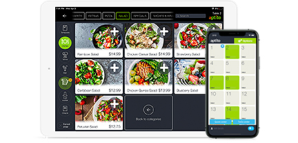
A well designed iPhone digital menu will load quickly, the customer can find the menu with their iPhone by merely visiting the restaurant and pressing the “menu” button, which will automatically load the menu. They should be able to see full-sized and easy-to-read text, as well as high-resolution – but fast loading – pictures of menu items, and all without having to slide their fingers around the page. This design element ensures there is no user frustration associated with your menu. Happy users ultimately equate to more sales and reservations, and free viral advertising via word-of-mouth, SMS and social media sharing.


